COLLECTIVE TRUTHERS
WordPress website redesign and branding
ABOUT THE PROJECT
May 1st - May 31st 2021
Collective Truthers is a small book publishing company that targets first-time authors that wish to share their story with the world.My task was to redesign the Collective Truthers website and create a new and fully responsive version on WordPress. I worked with a partner and first figured out clients wants and needs. From there, we researched our target audience and competition, and proceeded to create a brand image that fit with both our client and target audience.
WEBSITE CURRENTLY DOWN!
Project Deliverables

Study of Old Website
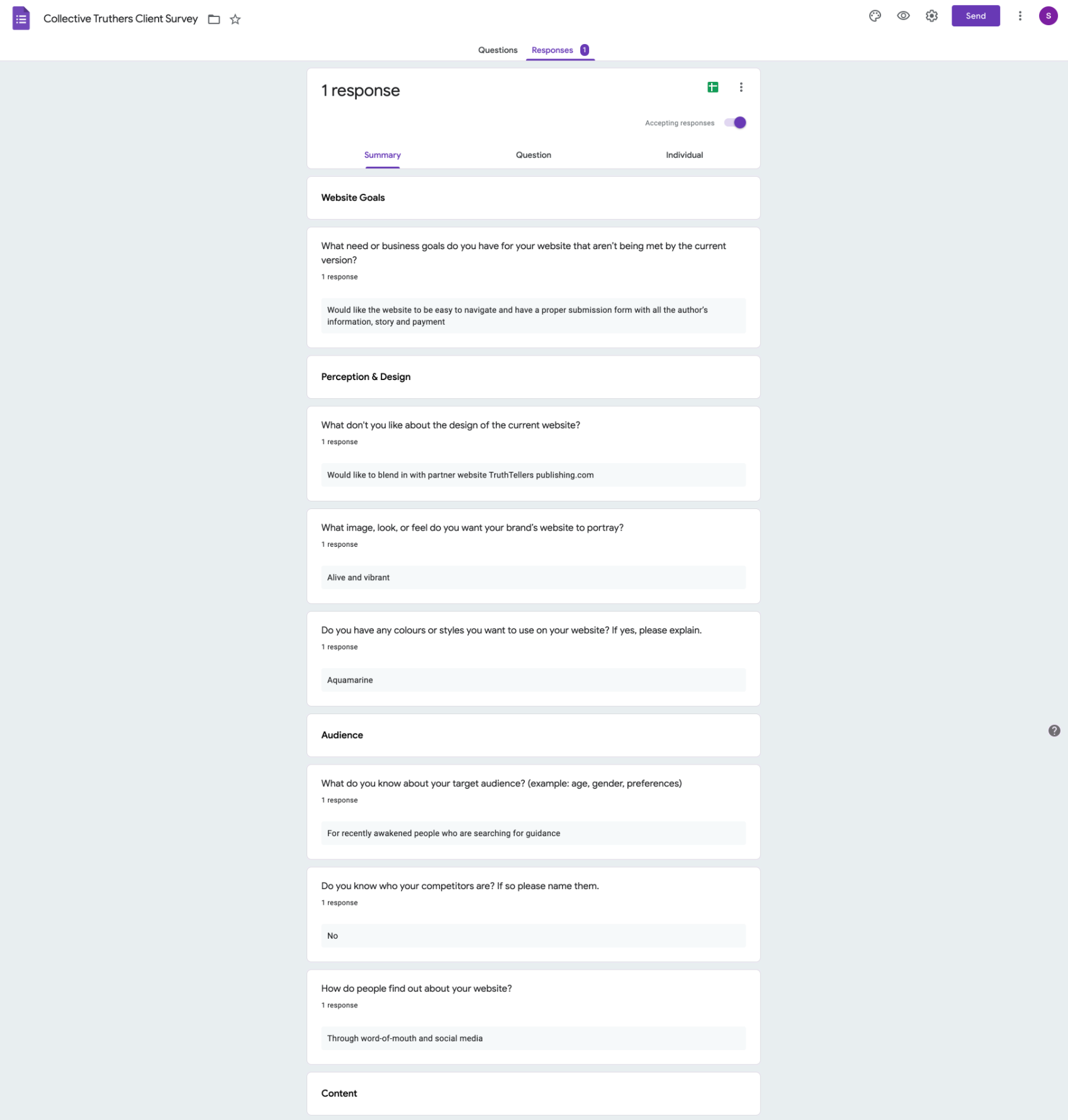
Client Survey
User Research and Competitive Analysis
Logo Design
Persona Creation
Mood Board
Style Guide
Author Pictures Photoshop Editing
Sitemap
WordPress Website Creation
Old Website
Analyzing the Original Website
The first thing we did was take a thorough inspection of the website. We looked where there were repeats of information, what should and shouldn't be found on the pages, where all the links lead to, as well as inspected page content. We checked through everything and questioned if each element really needed to be on the page or not. Each problem we came accross, we made note of. One of the biggest problems noticed was repetition of information across pages.
Survey
CLIENT NEEDS
From there we had many meetings with our client. We asked her thoughts on what she wanted for her new website as well as had her fill out a survey so that we had something in her own writing.
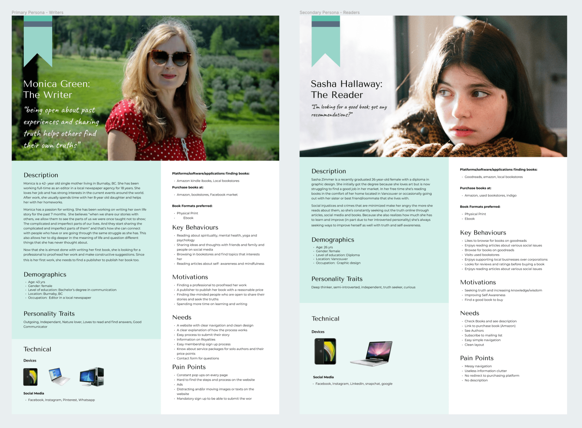
Persona
ABOUT THE USER
After our client filled out the survey we had a better idea of what she wanted. Next on our list was to figure out who her target audience was as well as their wants and needs. For this, we asked her to give us any information she already had while also conducting our own research, afterwhich we were able to put together a persona of her target audience.
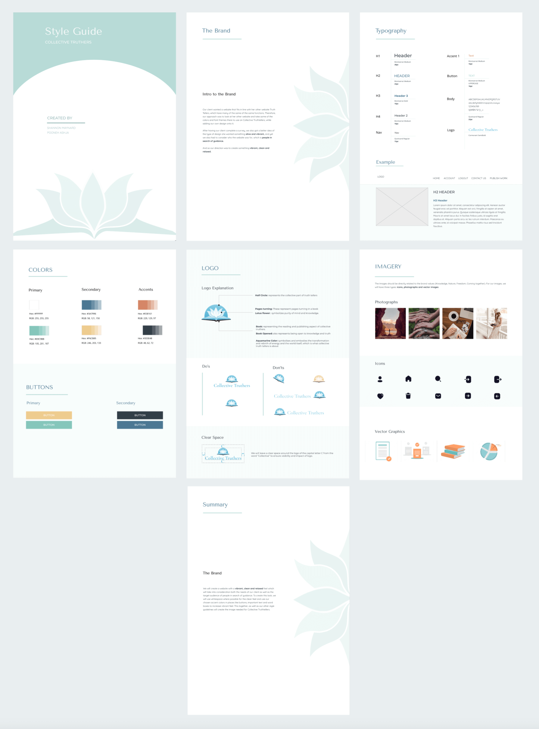
Logo
LOGO EXPLAINED
I designed this logo to include all 3 of the elements found in collective truthers.
- Open Book: symbolizes the book publishing aspect.
- Lotus flower/flipped pages: the flipped pages creates a connection to the book and lotus flower. Lotus flower symbolizes spirituality and wisdom (an important aspect to collective truthers brand)
- Half Circle: the collective in collective truthers
- Color: aquamarine color, asked for by the client. One of the colors of the chakra
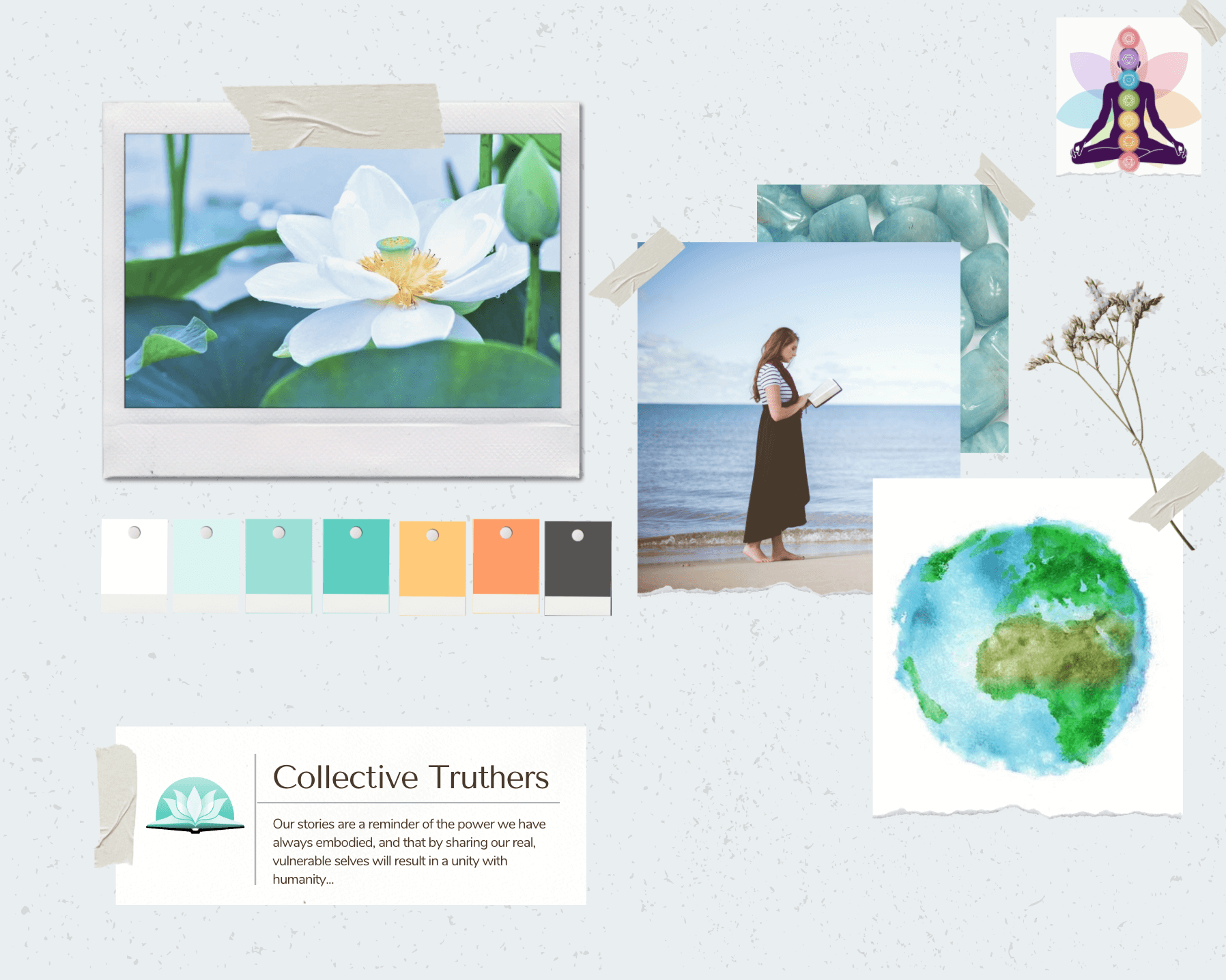
Mood Board
THE MOOD DESIGN
Knowing our audience, and logo, I went ahead and put together a mood board. This was to get a basic look and feel for the website.
Style Guide
DESIGN DIRECTION
With the previous preparation in place we started putting together the style guide. Here, we focused on finding calming blue colors for primary and took our accent colors from the sister site truthtellerspublishing. This was to have make a connection in design between both websites. We also used the font, Cormorant Garamond, from logo for our headings. The design was to produce a modern, peaceful look.
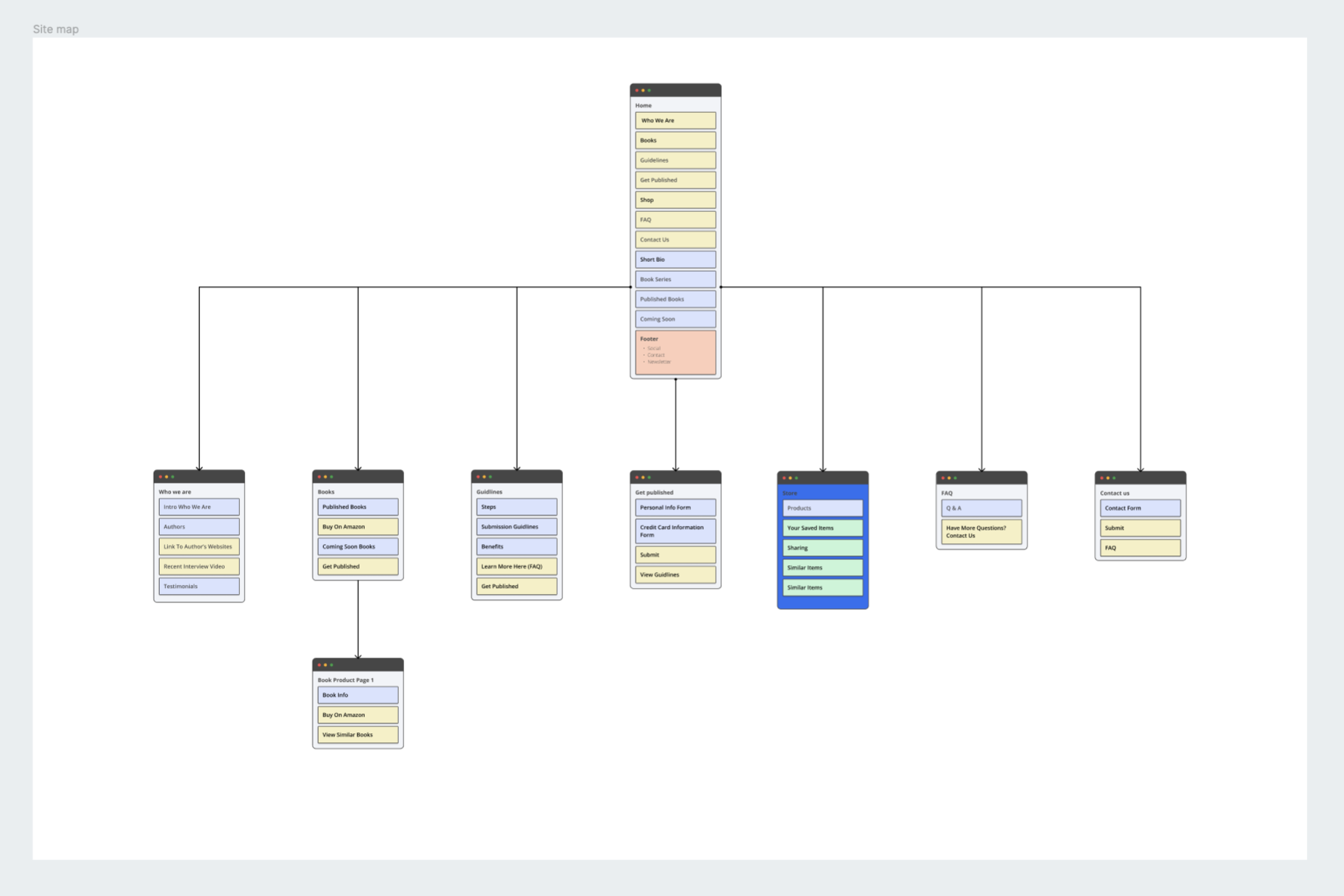
Sitemap
MAPPING THE SITE
This step was crucial before starting the website layout. Due to the original website having many problems, such as repitition of information, broken links and a general disorganization, we had to think carefully on where all the content should be placed. Additionally, the client also had additional content she wanted in the new site, so creating the information architecture required careful planning.
Low Fidelity
ABOUT THE USER
After our client filled out the survey we had a better idea of what she wanted. Next on our list was to figure out who her target audience was as well as their wants and needs. For this, we asked her to give us any information she already had while also conducting our own research.
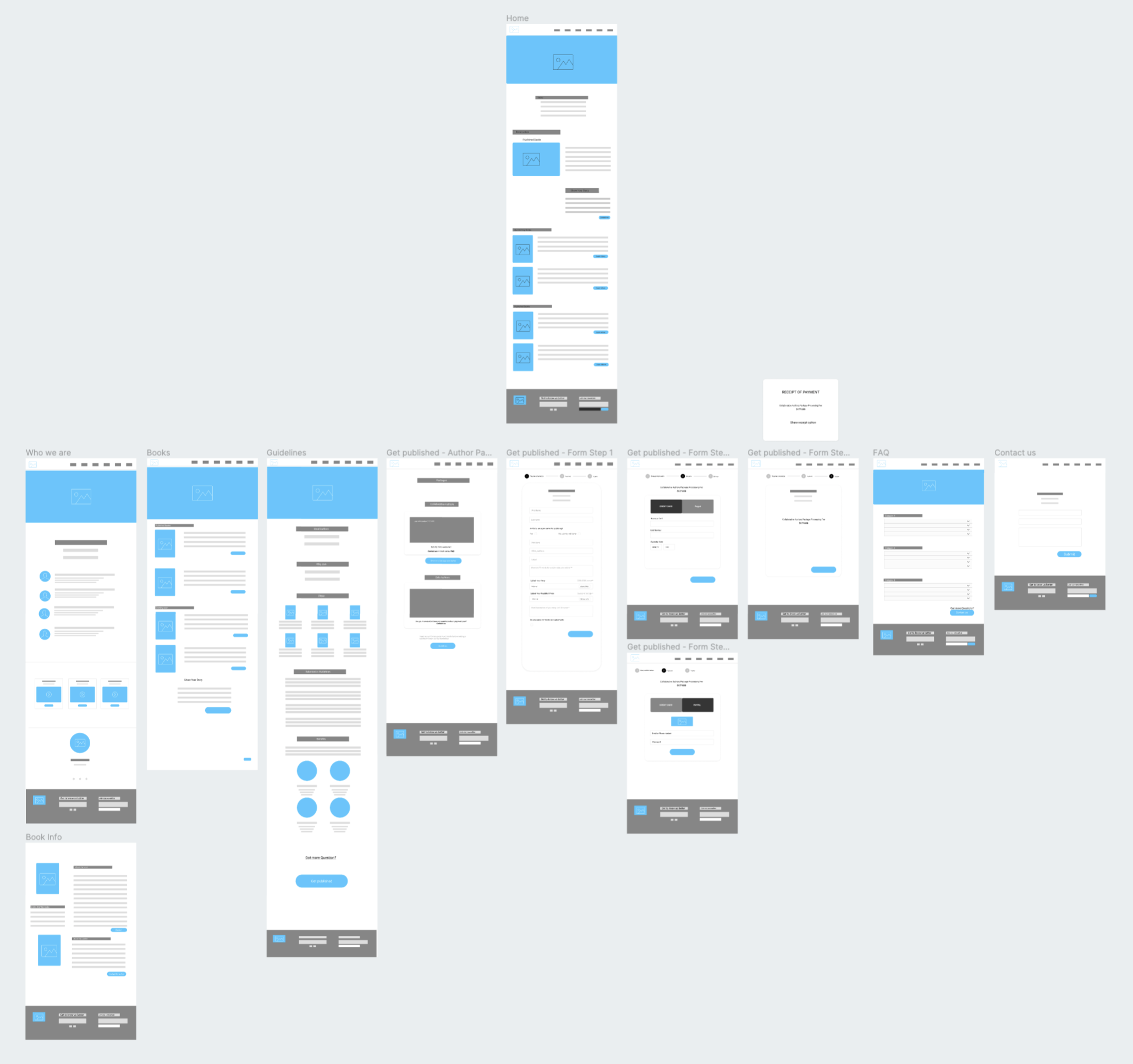
Web Pages
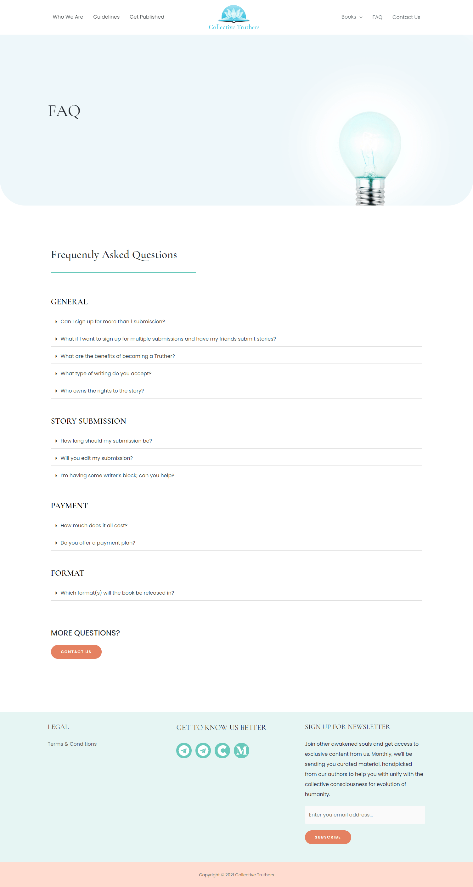
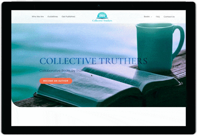
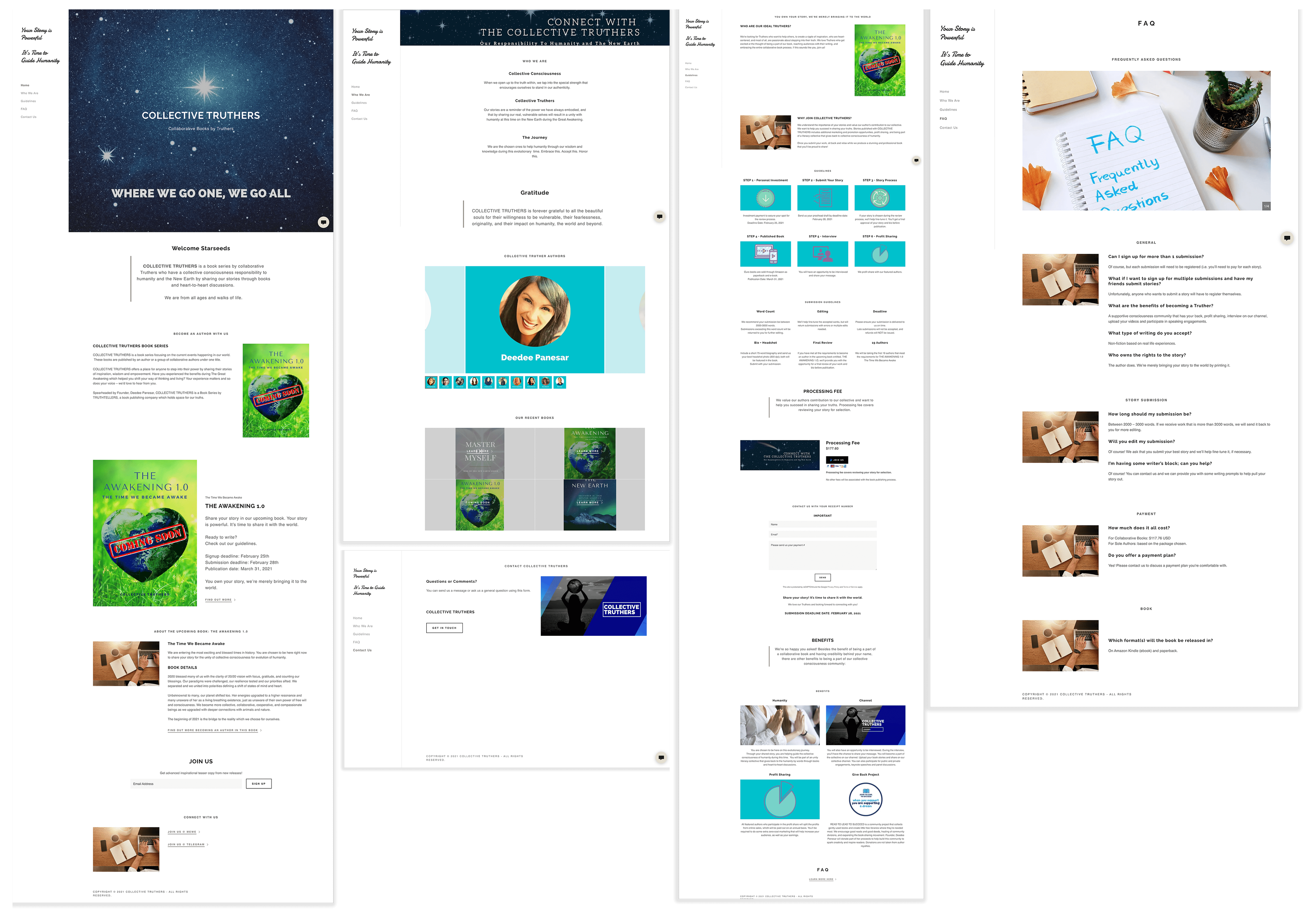
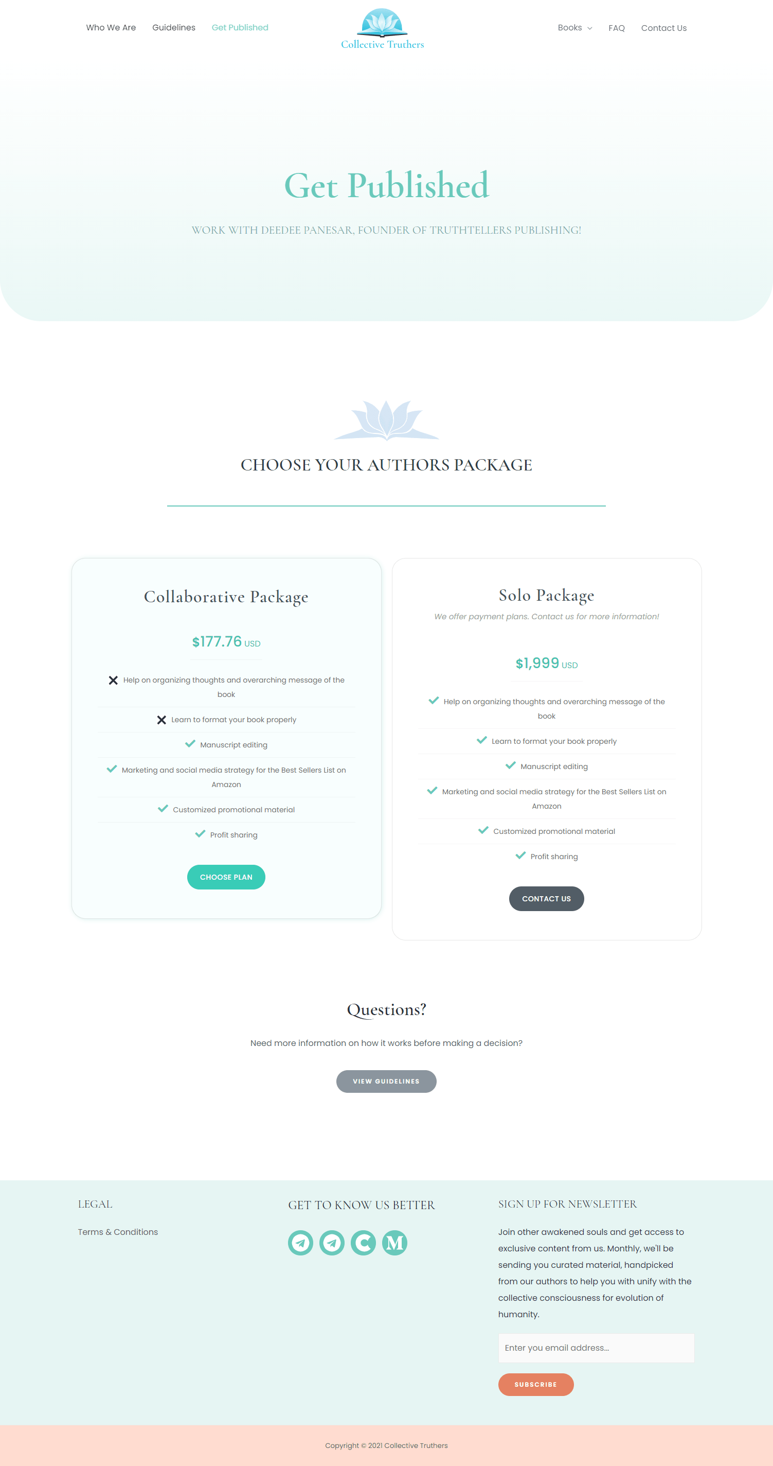
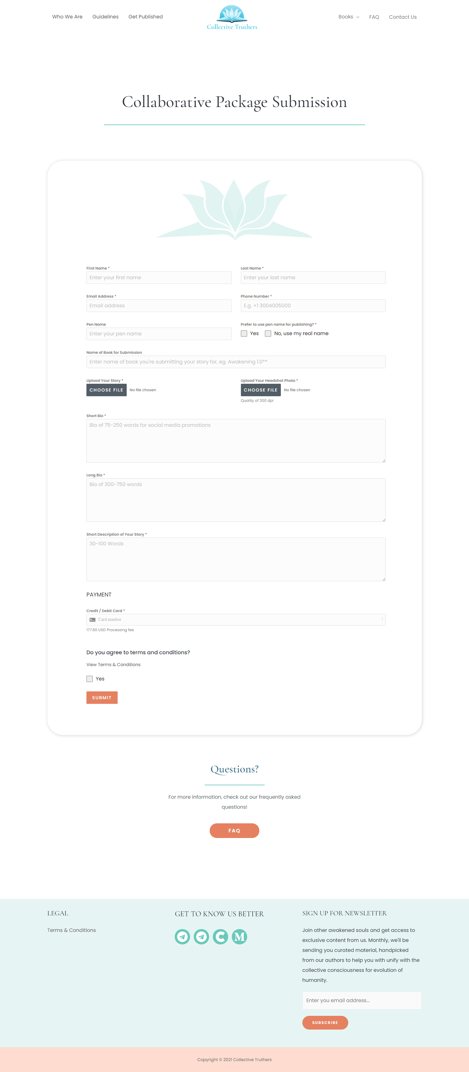
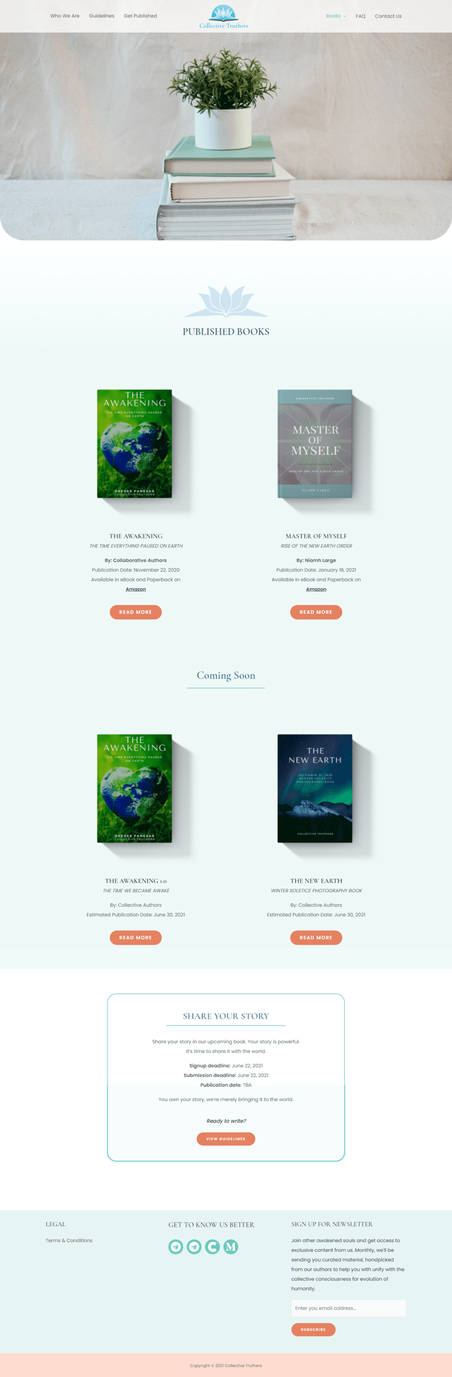
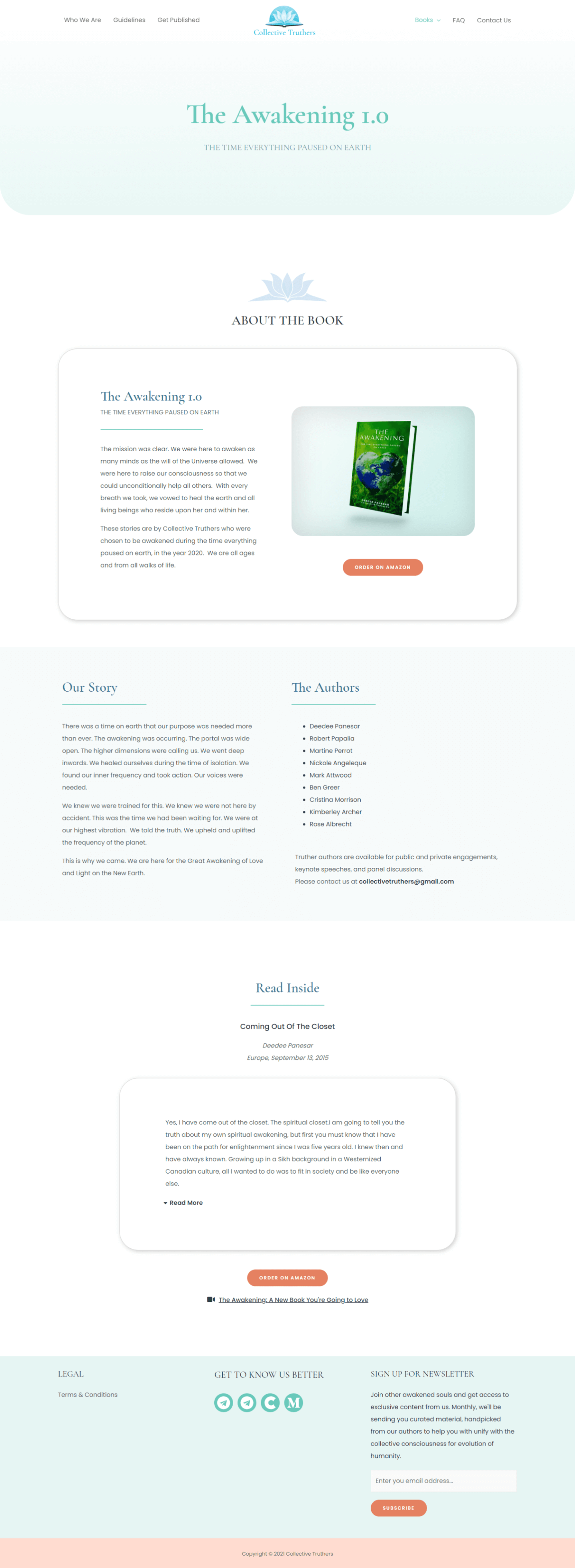
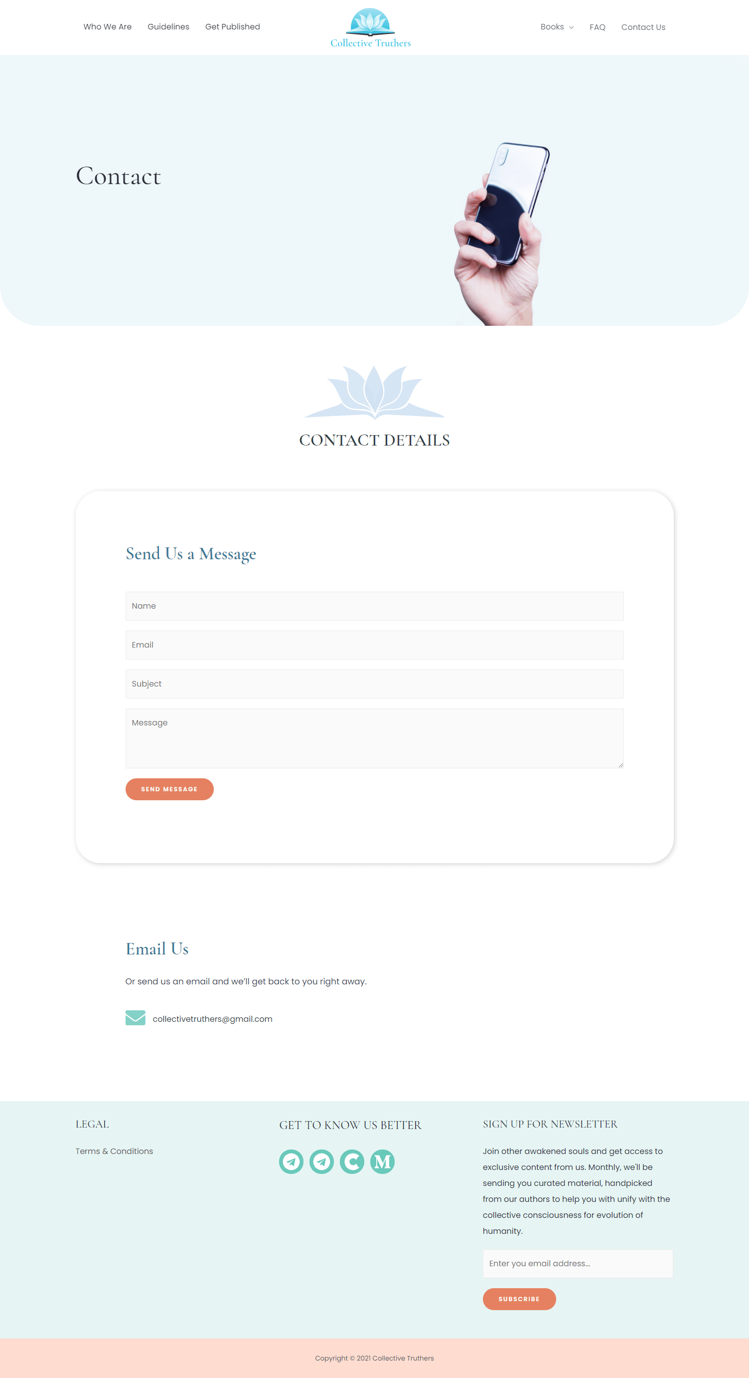
Here are some of the main pages I worked on. These pages were put together almost completely with elementor, so each element was carelly thought through during the design process. The only page with e-commerce is the book submission page, where we used a plugin to send the fixed amount asked for in the Collaborative Package. The website is currently down, so viewing live isn't possible.
HOMEPAGE

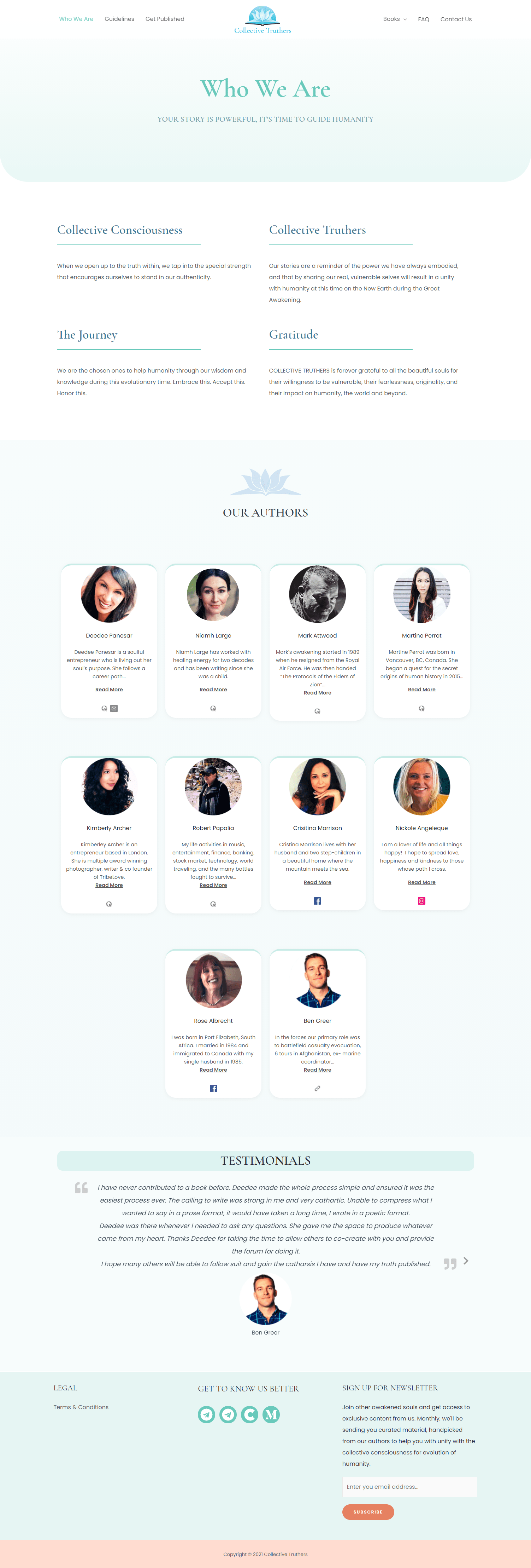
WHO WE ARE
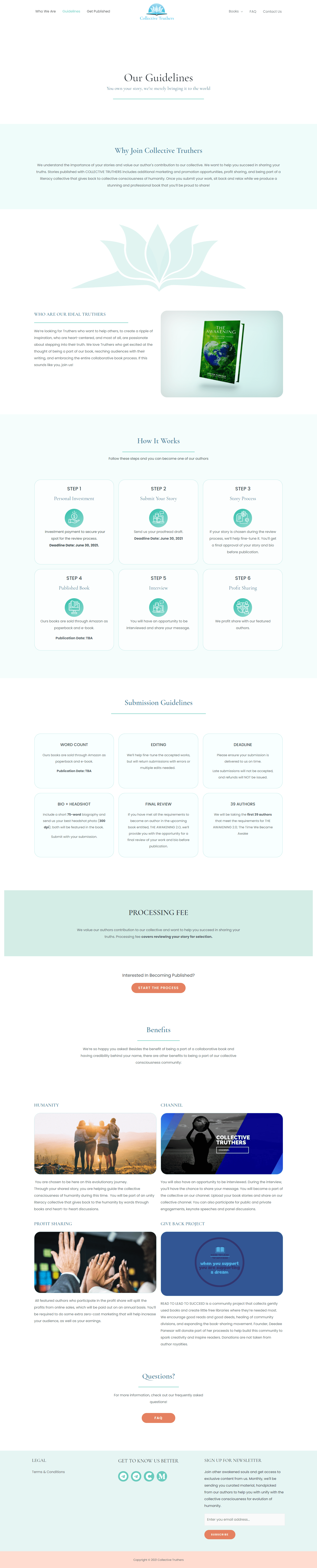
GUIDELINES
GET PUBLISHED
BOOK SUBMISSION
BOOKS PAGE
BOOK INFO PAGE
CONTACT PAGE
FAQ PAGE